Shopping cart
Your cart empty!
Your cart empty!


Empower your decisions with Enquete.com – the all-in-one platform for creating, customizing, and distributing online surveys tailored to your needs.
No credit card required.
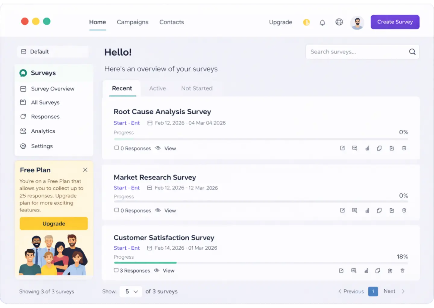


Join the thousands of satisfied users and take your marketing, Customer satisfaction, HR and Employee satisfaction surveys to the next level.

Design surveys effortlessly with our intuitive survey builder and ready made templates, inspired with simplicity mind.
Let's find out
Choose from a rich library of ready-to-use templates tailored for business, education, HR, healthcare, events, and more.
SEE +80 TEMPLATES
Personalize your surveys with custom branding, question logic, multilingual support, and dynamic layouts.
Let's find out
Access real-time responses, interactive dashboards, charts, and exportable reports to make better data-driven decisions.
Let's find out
We prioritize your data with GDPR-compliant practices, end-to-end encryption, and secure cloud storage.
Let's find out“I rely on Enquete for various survey projects—from small groups to large audiences. Its flexible data collection methods and robust analytics make it a powerful feedback tool. I also value the library of survey templates, which perfectly align with our needs.”